What is Data Visualization, and Why is it Important?
Before moving to the term data visualization, let’s discuss the term data science because this is where the word data visualization comes from. Data science is defined as the science of analyzing any data using statistics and machine learning techniques in order to make inferences about that data. But do you have any idea about what the data science pipeline is?

In data science, a pipeline is a set of actions that converts raw (and confusing) data from various sources (surveys, feedback, lists of purchases, votes, and so on) into an understandable format to store and analyze. Within a pipeline, raw data passes through several stages, including:
- Fetching data
- Cleaning data
- Data visualization
- Data modeling
- Data interpreting
- Revision
Here in this article, we will go deeper into data visualization.
What is Data Visualization?
The graphical representation of information and data in a visual or graphic format is known as data visualization (Example: charts, graphs, and maps). Data visualization tools make it easy to see and recognize patterns, trends, and anomalies in data. Data visualization tools and technologies are critical for analyzing large amounts of data and making data-driven decisions.
Categories of Data Visualization
Data visualization is an essential tool in the iterative process of grasping the massive amounts of data generated by big data. It is difficult enough to sift through the severe flooding of big data to find related, beneficial information, let alone identifying trends and developments. That’s why data visualization is essential for today’s big data and other users, which makes it easier for data collectors to communicate their findings and readers to see trends and patterns.
We’ve talked about how big data necessitates data visualization, so let’s continue the conversation by looking at the five main data visualization subgroups that can be discovered in big data instances.
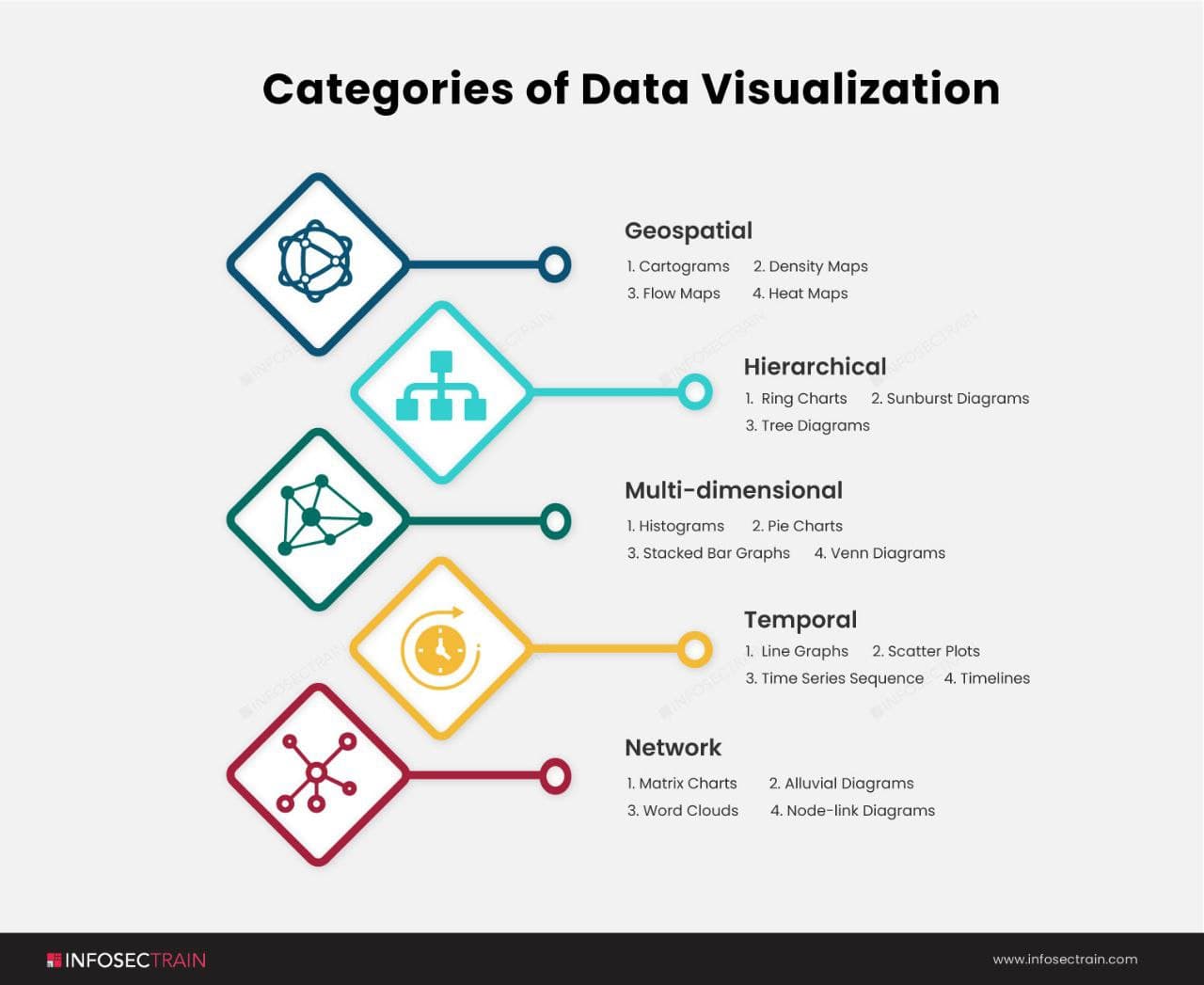
- Geospatial: Geospatial data visualization combines maps and data points to represent real-world locations. Geospatial data visualization is frequently used in market penetration studies.
- Hierarchical: When presenting data clusters, the hierarchical technique classes data within larger groups and is frequently used, especially if the data comes from a solitary site of origin.
- Multi-dimensional: This method creates a three-dimensional data visualization by combining two or more variables.
- Temporal: Visualizations of temporal data should be sequential and one-dimensional. This method employs lines that can stand by themselves or coincide and a start and end time frame.
- Network: The network method demonstrates relationships between datasets without resorting to lengthy explanations.
Importance of Data Visualization
People can see and understand data patterns, trends, and outliers by visually representing insights derived from data. “Do you want me to draw you a picture?” is a counterargument that you should be aware of intended for someone who has difficulty understanding what the speaker is saying. On the other hand, data visualization paints that picture by presenting facts and figures clearly and visually strikingly. It’s also a valuable tool in the iterative effort to grasp the massive amounts of data generated by big data. The following are some of the benefits of data visualization:
- Discover trends in data: One of the essential functions of data visualization is to reveal data trends. After all, observing data trends is much easier when all of the data is placed out in front of you in a visual medium rather than data in a table.
- Provide perspective of data: Data visualization sheds light on data by illustrating its significance in the grand scale of things. It illustrates where specific data sources stand in relation to the overall data image.
- Puts data into the correct context: With data visualization, it is extremely difficult to understand the context of the data. It provides a simple means of disseminating information, allowing users to share their ideas with everyone associated with the research.
- Saves time: Using data visualization to glean insights from data is unquestionably faster than simply studying a chart. It is very easy to spot the regions struggling with a total loss rather than a profit in Tableau.
- Tells data story: Data visualization can also be used to tell a data story to the audience. The visualization can understandably introduce data facts while telling a story and leading the audience to an inescapable conclusion.
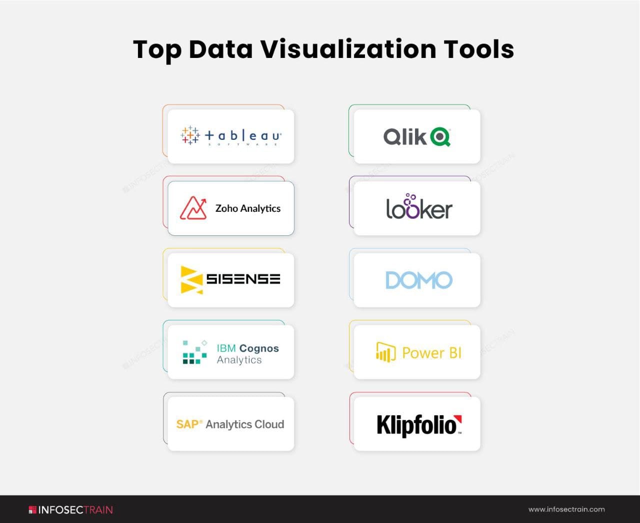
Top Data Visualization Tools
The best interactive data visualization tools are listed below:
Advantages of Data Visualization
Real-world examples, of which there are many, are the best way to demonstrate the capabilities of data visualization techniques. As an example:
- The easiest way to determine correlations between two variables is to compare them visually.
- Analysts can locate viewer subgroups, any essential variables and the roadways between them, and statistical exceptions by examining the network.
- People can use visualization to see and analyze how data trends change over time.
- Frequency is similar to tracking changes, but it examines how frequently a given event occurs.
- Project managers can visualize each task within the project and how long it will take using a tool like a Gantt chart.
Data visualization is helpful in a wide range of fields, including:
- Data Science: Data visualization aids data scientists in complicated data analysis, analytical thinking, and dataset comprehension.
- Finance: In the investment world, data visualization is a valuable tool for displaying how goods, bond funds, and stocks operate over time.
- Healthcare: To illustrate numerical values, choropleth maps show different geographical areas in different colors. Physicians and epidemiologists who can track health threats such as epidemics or heart disease will find them helpful.
- Logistics: Data visualization can assist shipping companies in determining the best trade routes.
- The Sciences: Researchers can better understand their experimental results with scientific visualization.
How can InfosecTrain help you in your career?
The world is increasingly reliant on data to make life easier and design more effective ways to address the commercial sector’s numerous difficulties. As a result, Data Analysts is one of the most in-demand personnel in today’s global business. They are knowledgeable IT data stars who understand how to transform the tons of data generated by big data into tangible, valuable information. With this popular Data Science certification training course, InfosecTrain can help you kickstart your Data Analytics career.

Contact Us


 1800-843-7890 (India)